Fino
TypeTogether · Ermin Međedović · 2016
displayDidone displayitalic
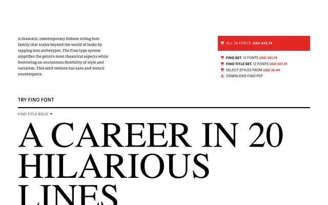
A theatrical contemporary Didone with narrow proportions and high contrast, offering Sans and Stencil companions for versatile titling applications.
About
Fino amplifies the dramatic qualities of the Didone genre through sharp hairlines, extreme weight contrast and narrow letterforms that command attention at display sizes. Title versions with finer hairlines are tuned for larger applications. Twenty-four fonts across three subfamilies — Serif, Sans and Stencil — give designers considerable range.
Classification
Dramatic contemporary Didone with narrow proportions, sharp details and high contrast; includes Sans and Stencil subfamilies
Weights
UltrathinThinLightRegularMediumBold
Optical sizes and widths
Title
Family
Fino SansFino StencilFino Title
Languages
Latin
Tags
displaydidonetitlingstencilfashionhigh-contrast