Ploquine
TypeTogether · Emma Marichal · 2024
slabStructured slab serifitalic
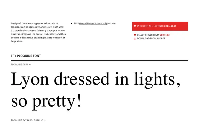
A structured slab serif with unusual horizontal terminals and extra-large capitals, rooted in historical wood type and shaped by the Gerard Unger Scholarship.
About
Ploquine draws on wood type traditions to produce a slab with structured delicacy — the distinctive horizontal endings on 'a' and 't', oversized capitals and serifs treated as expressive elements rather than mechanical fixtures. Fourteen styles span Thin to Extrabold with italics, plus two variable fonts. Suited to editorial, museum catalogues and poster work.
Classification
Slab serif with unusual horizontal terminals on 'a' and 't'; extra-large capitals; inspired by historical wood type; 2022 Gerard Unger Scholarship winner
Weights
ThinExtralightLightRegularMediumBoldExtrabold
Languages
Latin
Tags
slab-serifeditorialbrandingdisplaywood-typemuseum