TT Hoves Pro
A Scandinavian geometric sans in 96 styles spanning multiple widths, a mono variant and variable fonts, aimed at corporate and technical applications.
About
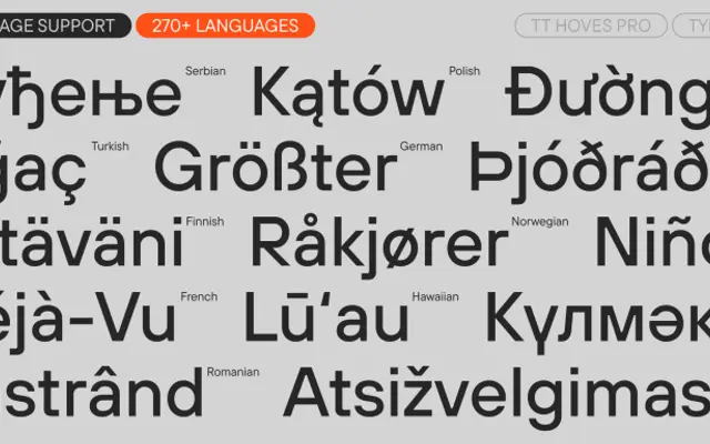
Built around horizontal and vertical construction logic, TT Hoves Pro sits between strict neutrality and mild character, making it practical for branding, UI and editorial contexts. The family covers Compact, Condensed, standard and Expanded widths alongside a monospaced package, with Latin and Cyrillic script support and a substantial set of OpenType features including small caps, old-style figures and multiple stylistic alternates. Real-world adoption by clients including PayByPhone, Branch.io and Telefónica illustrates its positioning as a dependable corporate workhorse.
Classification
Described by TypeType as a Scandinavian geometric sans, the name itself derives from 'horizontals + verticals', pointing to its construction logic. The forms are geometric but moderated, sitting between strict neutrality and mild personality.