TT Modernoir
TypeType · Antonina Zhulkova, Toma Streltsova, Stanislav Tikhonov, Elizabeth Ostrovskaya · 2024
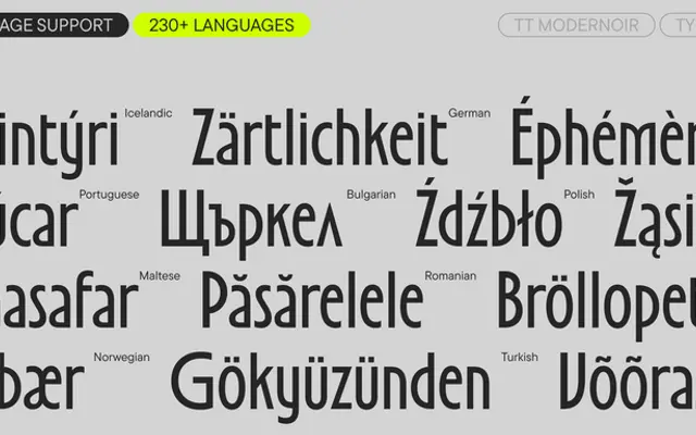
A display sans drawing on 20th-century French typography and Art Nouveau, built around extreme contrast between narrow square and wide oval characters.
About
The defining tension in TT Modernoir is proportional: square characters are set very narrow while oval ones spread wide, producing a syncopated rhythm across a line. Curved legs and dynamic swirls reinforce the Art Nouveau and film noir references that give the family its name. Six styles span Light to Bold plus a variable weight axis, with 38 OpenType features including condensed ovals, underlined glyphs, a curly set and a small icon collection of cats, arrows and musical notes.
Classification
An all-caps-origin display sans with extreme contrast between narrow square and wide oval characters, curved legs, and decorative swirls drawn from Art Nouveau and film noir aesthetics. Its ornamental character and large-size focus place it firmly in the display category.