TT Norms® Pro Serif
TypeType · Marina Khodak, Ksenia Karataeva, Antonina Samokhina, Yuriy Nakonechny · 2022
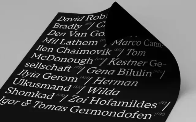
A low-contrast serif developed as a companion to the bestselling TT Norms Pro sans, sharing its proportional logic and open aperture across 24 styles.
About
Drawn over a full year with the explicit aim of pairing with TT Norms Pro, the family carries recognisable traits from the sans: dynamic widths, slanted oval axis and low stroke contrast. True italics rather than mere obliques were designed separately, with lowercase letterforms shifting toward handwritten shapes to mark emphasis without disrupting reading flow. The 1380-glyph character set covers 235 or more languages, with variable fonts available for both roman and italic axes.
Classification
Low stroke contrast, slanted oval axis and open aperture place this in a transitional zone, though the brutal serifs and geometric proportions tie it closely to the sans-serif TT Norms Pro from which it was derived.