TT Regins
TypeType · Marina Khodak, Anastasia Vrublevskaya, Antonina Samokhina, Anna Kondrashova · 2025
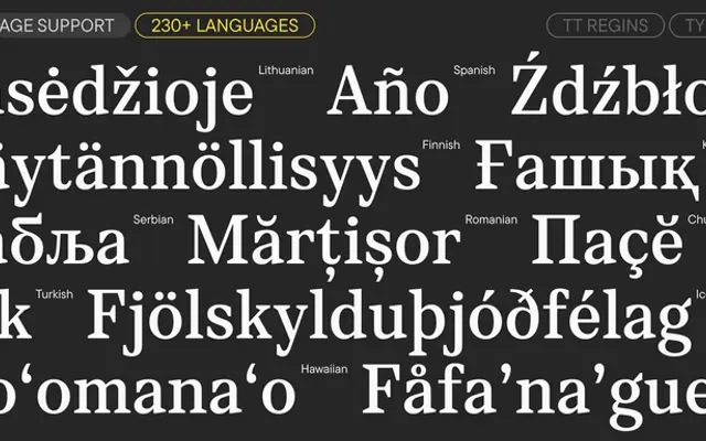
A high-contrast Neoclassical serif with sharp triangular serifs, split across three optically calibrated subfamilies for text, subheading and display use.
About
Built in the Didone tradition, TT Regins pairs extreme stroke contrast with sharp triangular serifs and a slightly condensed upright proportion. Three subfamilies, Text, Subhead and Display, each tune contrast and spacing to their intended point-size range, while two variable fonts cover the full weight and optical-size axes. The true italic, slanted at 14°, switches to semi-rounded bottom serifs to create a sense of forward motion distinct from the upright.
Classification
Described by the foundry as a Neoclassical (Modern) serif with high stroke contrast and sharp triangular serifs, placing it firmly in the Didone/Modern tradition. Three optical subfamilies (Text, Subhead, Display) confirm its classical editorial lineage.