TT Runs
TypeType · Marina Khodak, Antonina Zhulkova, Anastasia Pogorelova, Lada Sobchenko · 2020
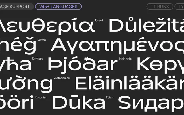
A wide display sans with deliberately inverted stroke contrast, designed around research into Olympic venue identities and sports branding.
About
The typeface uses unusually wide proportions and a contrast that reverses the classical axis, most visible in uppercase and Cyrillic characters such as K, R and Ж, giving letterforms an energetic, unfamiliar quality. Nineteen styles span nine upright weights, nine italics and a variable font with weight and slant axes, with 1,160 glyphs per style covering over 245 languages. Though purpose-built for sportswear and athletic identity, the proportions work equally well in editorial display contexts requiring strong visual accent.
Classification
Described by the foundry as a wide display sans serif with inverse stroke contrast relative to the vertical axis, creating unconventional proportions suited to sports branding rather than general text use.