seriftransitional serif
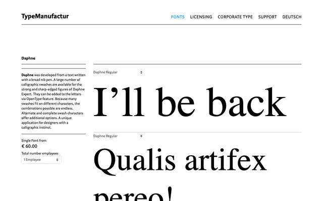
A single-weight text serif from Typemanufactur, shown across literary and editorial specimen settings.
About
Daphne is offered in a Regular weight, demonstrated through extended prose passages that suggest its primary orientation toward text-heavy editorial and literary use. The specimen favours long-form copy, from Pynchon to Louise Erdrich, implying a typeface built for sustained reading rather than display. Only one weight is shown on the page, giving it a restrained, focused character.
Classification
Daphne presents as a text serif with classical proportions suited to extended reading, consistent with a transitional or humanist serif classification based on the specimen's rendering at various sizes.
Weights
Regular
Languages
Latin
Tags
seriftextelegantclassicaleditorialliterary