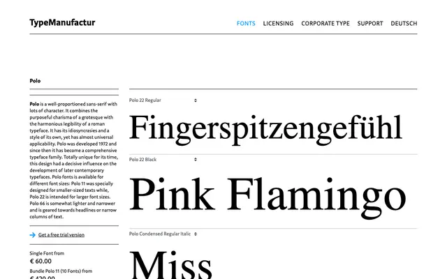
A large-system grotesque from Typemanufactur, structured across three optical sizes, multiple widths and five weights with matching italics and a smallcaps subfamily.
About
Three numbered optical variants — 11, 22 and 66 — anchor the family for different point sizes and output conditions, each running from Light to Black with italics throughout. Width variants extend from Extracondensed through Condensed and Compressed, broadening the palette for poster and tight-column work. A dedicated Smallcaps subfamily and two display-weight singles, Extralight and Fino, round out a system built for sustained typographic use.
Classification
The family's broad range of optical sizes, widths and weights, alongside its clean upright structure with no visible serif detail, places it firmly in the grotesque sans-serif tradition. The numbered optical size variants (11, 22, 66) and compressed/condensed widths are characteristic of a systematic, text-oriented grotesque.