sans-serifgrotesqueitalic
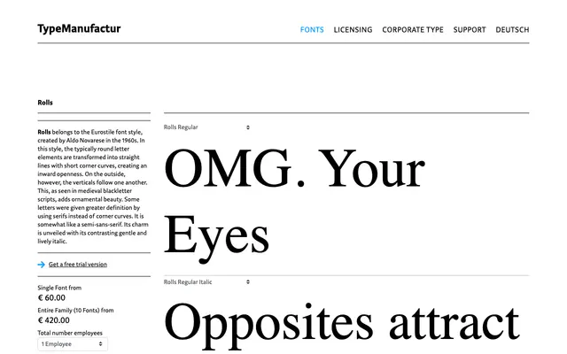
A five-weight grotesque sans from Typemanufactur, each weight paired with an italic, suited to editorial and identity work.
About
Ten styles span five weights from Light to Black, each accompanied by a matching italic. The family reads cleanly at text sizes and carries enough presence for display settings, making it a workable choice for editorial design, branding and cultural institutions. Its tone is controlled and neutral without being anonymous.
Classification
The even stroke contrast, neutral letterforms and range of weights from Light to Black place Rolls firmly in the grotesque sans-serif tradition, suitable for editorial and display use alike.
Weights
LightRegularMediumBoldBlack
Languages
Latin
Tags
grotesqueeditorialneutraldisplaytextsans-serif