Aloma
Typerepublic · Andreu Balius · 2017
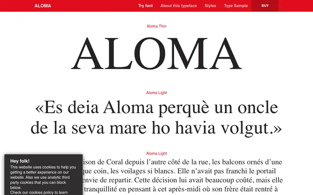
A neoclassical serif by Andreu Balius inspired by Mercè Rodoreda's 1938 Catalan novel and the aesthetics of Deco magazine lettering.
About
Designed between 2017 and 2020, the family draws on Art Deco headline lettering and the principles of the Catalan Noucentisme movement, resulting in high-contrast roman proportions with deliberate inconsistencies across certain letterforms. Five weights from Thin to Bold are offered, each with an italic, covering an extensive range of Latin languages. Its sharpness and contrast make it best suited to editorial titling, magazine covers and short display settings rather than extended text.
Classification
Aloma is described as Neoclassical in style with classical Roman proportions and high stroke contrast, drawing on Deco lettering and the Catalan Noucentisme movement, placing it firmly in the neoclassical serif tradition.