Carmen
Typerepublic · Andreu Balius · 2007
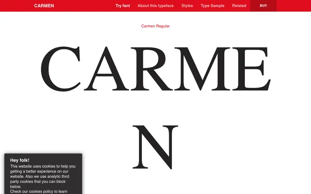
A high-contrast neoclassical serif by Andreu Balius, originally commissioned for a new edition of Prosper Mérimée's novella Carmen, with delicate hairline strokes and gently curved italics.
About
Designed between 2007 and 2008, the typeface takes its character from the romantic myth of its namesake: high stroke contrast, smooth rounded terminals and italics that tilt lightly as though mid-movement. Three weights run from Regular to Black, each with a matching italic, giving the family enough range for display and sustained text setting. It was recognised as Best Typeface of 2008 by Typographica and featured in FontShop's Top Type 2009.
Classification
High-contrast design with smooth rounded terminals and delicate hairline strokes places it firmly in the neoclassical tradition, akin to Didone but with softer, more organic terminal treatment.