Carmen Cyrillic
Typerepublic · Andreu Balius · 2007
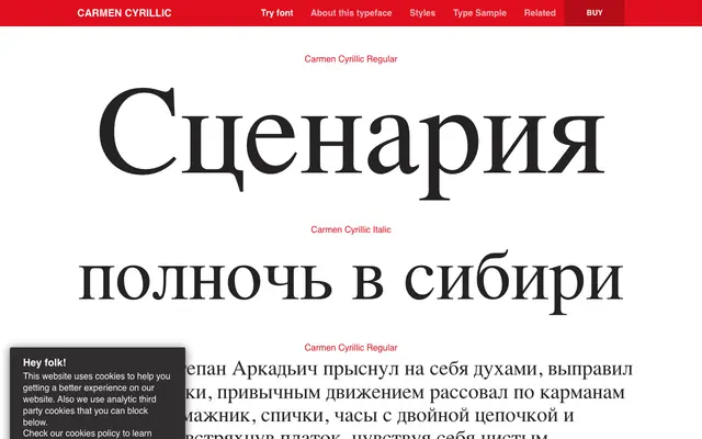
A high-contrast neoclassical serif with Cyrillic support, originally commissioned for a new edition of Mérimée's novel Carmen, recognised as one of Typographica's best typefaces of 2008.
About
Designed by Andreu Balius between 2007 and 2008, with Cyrillic advisory from Ilya Ruderman, the typeface draws on the neoclassical tradition with fine hairline strokes, smooth rounded terminals and a gently inclined italic that the foundry describe as approaching the text like a dance. Cyrillic coverage extends to Russian, Serbian and Ukrainian, alongside a broad Latin character set spanning many European and minority languages. Its literary origins and award recognition from both Typographica and FontShop mark it as a considered text face with a distinct thematic identity.
Classification
High-contrast design with smooth rounded terminals and delicate thin strokes, placing it firmly in the neoclassical or Didone tradition. The refined contrast and elegant italic cuts align with late 18th-century rational serif models.