Carmen Display
Typerepublic · Andreu Balius · 2007
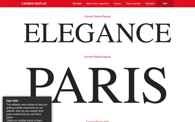
A high-contrast neoclassical display face by Andreu Balius, originally designed for a new edition of Prosper Mérimée's novel and later adapted as a custom typeface for Victoria's Secret.
About
Drawn with fine hairline strokes, soft rounded terminals and a strong thick-thin contrast, Carmen Display sits within the neoclassical serif tradition while leaning toward the ornamental and sensual. The family comprises just two styles, Regular and Italic, with the italic cut described as gently slanted and almost fragile in character. An extensive Latin language list and OpenType feature set including oldstyle figures, historical ligatures and discretionary ligatures make it more capable than its two-style footprint suggests.
Classification
High-contrast letterforms with soft, rounded terminals and fine hairline strokes place this squarely in the neoclassical tradition, akin to Didone designs but with a softer, more ornamental quality suited to display use.