Carmen Fine
Typerepublic · Andreu Balius · 2007
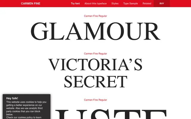
A high-contrast Neoclassical display serif by Andreu Balius, originally developed as a custom style for Victoria's Secret and released as part of the broader Carmen family.
About
Drawn with hairline strokes, rounded terminals and a strong vertical axis, Carmen Fine sits firmly in the Neoclassical tradition, designed for titles and headings rather than running text. The italic cuts are gently inclined with softened curves, giving the family a delicate, almost fragile quality suited to fashion and luxury contexts. Extensive Latin language support and OpenType features including oldstyle figures, historical forms and two stylistic sets extend its editorial utility.
Classification
High-contrast design with fine hairline strokes, rounded terminals, and a strong axis characteristic of Neoclassical or Didone serifs, positioned as a display cut for headline use.