Mecano
Typerepublic · Andreu Balius · 2007
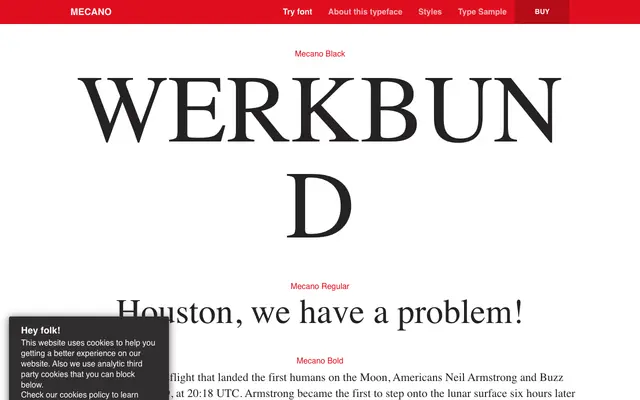
A geometric display face by Andreu Balius that draws on mechanical technology and science fiction aesthetics across five weights.
About
Designed in 2007 by Andreu Balius, Mecano takes its cues from geometric forms associated with mechanical technology, sci-fi films and futurist pop culture. The five weights from UltraLight to Black give it a workable range for titling and editorial use, though no italic or condensed cuts are available. Its clean, spacious letterforms lend themselves to contexts where a retro-futurist or B-movie flavour is appropriate.
Classification
Mecano is built on geometric forms with clean, open shapes that evoke mechanical technology and sci-fi aesthetics, placing it firmly in the display category rather than a workhorse geometric sans.