Rioja
Typerepublic · Andreu Balius · 2014
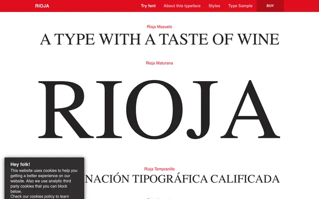
A geometric grotesque originally designed for the University of La Rioja, with six weights named after grape varieties from the Rioja wine region.
About
Designed by Andreu Balius between 2008 and 2015, Rioja draws on early 20th-century geometric and grotesque models while maintaining a clean, disciplined structure. The uppercase is characteristically simple and rectangular, broken by details such as the J descending below the baseline, while the lowercase prioritises group harmony and readability at text sizes. Six weights run from the light Viura through to the heavy Maturana, each taking its name from a grape variety native to the region.
Classification
Rioja is described by its designer as inspired by geometric and grotesque styles of the early 20th century, combining a clean geometric structure in the uppercase with humanist detailing in the lowercase.