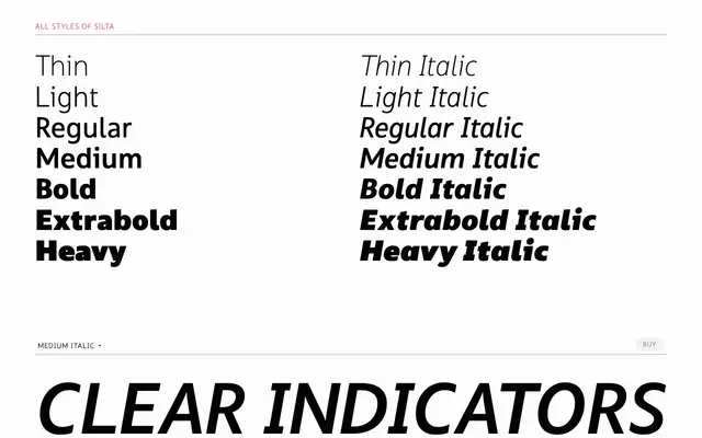
A humanist sans designed for interface legibility, with true italics and broad Latin script coverage across seven weights.
About
Built with legibility and warmth as its guiding principles, Silta targets interface typography where a human touch is needed without sacrificing clarity. Its italics are true italics: the 'a' and 'f' take distinctly italic forms rather than simply slanting, and curved entry and exit strokes on vertical stems give the family a natural rhythm. Language coverage spans a very wide range of Latin-script languages, and OpenType features include proportional and tabular figures, fractions, ordinals, superscript, subscript and scientific inferiors.
Classification
Designed with legibility and warmth as primary concerns, with true italics featuring distinctly shaped letterforms and curved entry and exit strokes on vertical stems, characteristics of humanist sans design.