VCTR Mono
Vectro · Travis Kochel · 2018
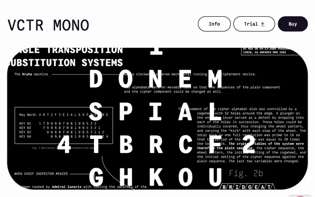
A warm, slightly goofy monospaced typeface drawn from the engraved lettering on Leica and Nikon camera bodies, released across six weights with italics.
About
Originally designed for the exif.co project under the name ISO, VCTR Mono takes its cue from the tightly spaced text on manual camera lenses and bodies, bringing a tactile irregularity that sets it apart from colder technical monospaces. Six weights from Thin to Black each carry an italic companion, giving the family real range for both interface and editorial use. OpenType features include oldstyle numerals and an alternate double-width em dash.
Classification
A fixed-width typeface throughout, designed explicitly for monospaced use, inspired by the lettering found on camera bodies and lenses. The warm, slightly irregular quality places it closer to humanist mono than strict technical mono.