Armin Soft
W Type Foundry · David Súid
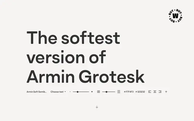
A softened grotesque in 14 styles, designed as an homage to Armin Hofmann's Swiss visual language with stylistic alternates for added flexibility.
About
Armin Soft is the rounded counterpart to Armin Grotesk, both conceived as tributes to the graphic vocabulary associated with Armin Hofmann. Seven weights from Thin to Black each come with an italic, and stylistic sets offer alternate forms for letters including G, R, a, g and t, giving designers room to vary the texture of a layout. The result is a grotesk that sits between Swiss neutrality and softer contemporary sensibilities.
Classification
Described explicitly as a grotesque and neo-grotesque, designed as a homage to Armin Hofmann's visual language; the 'Soft' variant implies softened terminals or curves relative to the parent Armin Grotesk.