Cannon
W Type Foundry · Patricio Truenos
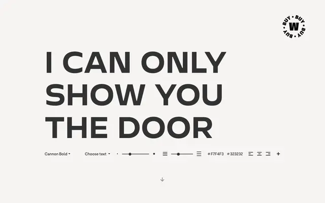
A neo-grotesque with geometric inflections across nine weights and matching italics, aimed at advertising, brand identity and packaging work.
About
Designed by Patricio Truenos, Cannon blends the clean structure of a neo-grotesque with geometric details to produce a typeface the foundry describes as carrying retro and technological character. The family runs to 18 styles across nine weights from Thin to Black, each with a matching italic, and includes small caps and alternate characters throughout. It suits bold headlines, short texts and high-impact brand applications where a familiar grotesque skeleton needs a little more visual energy.
Classification
Described by the foundry as combining neo-grotesque clarity with geometric touches, placing it firmly in the neo-grotesque subcategory with secondary geometric influence.