Fansan
W Type Foundry · Diego Aravena
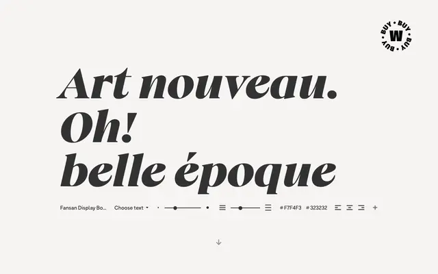
An Art Nouveau serif by Diego Aravena, taking cues from Benguiat, Windsor and Melbourne across two optical subfamilies and five weights.
About
Top-heavy stress runs consistently through the character set, giving lighter weights an elegant, pointed quality while heavier styles take on a more playful, expressive character. Sharp terminals on the lowercase a, f and g bridge the upper and lowercase forms, lending the family visual coherence across its range. With ten styles split between a text and a display subfamily, Fansan is built primarily for headline and display settings where typographic personality is the brief.
Classification
Fansan draws directly on Art Nouveau typographic tradition, sharing lineage with Benguiat, Windsor and Melbourne. Its top-heavy stress, sharp terminals and organic curves place it firmly in the decorative serif category with a strong display orientation.