Hartwell
W Type Foundry · David Súid
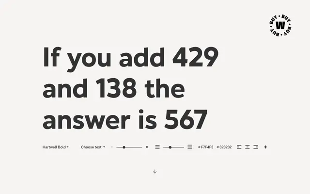
A neo-humanist sans by David Súid that blends calligraphic stroke terminals with geometric touches across 36 styles in two subfamilies.
About
Hartwell pairs the rhythmic, pen-influenced strokes of humanist sans tradition with geometric details, resulting in what the foundry terms a postmodern sans. Nine weights from Thin to Heavy are offered with matching italics, and a second subfamily, Hartwell Alt, mirrors the full weight range with alternate glyph forms. OpenType features include arrows, ligatures, fractions and alternate glyphs, positioning the family for editorial, branding and advertising work.
Classification
Described by the foundry as a Neo-humanist sans, combining calligraphic stroke terminals drawn from humanist tradition with geometric touches, placing it squarely in the humanist sans subcategory.