Hofmann Grotesk
W Type Foundry · David Súid
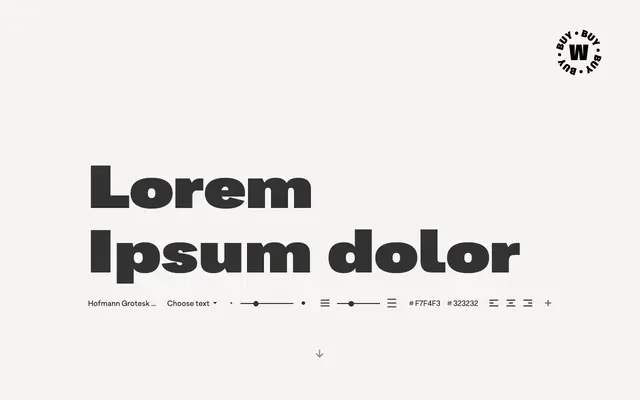
A grotesque family in 22 styles, inspired by Swiss designer Armin Hofmann, with three alternate character sets and a width axis spanning Compressed to Expanded.
About
Designed by David Súid, the family spans two subfamilies: a core grotesque range from Thin to Black and a width-focused extension covering Compressed, Medium and Expanded cuts, each with italics. Three alternate character sets — default, display and classic — allow the personality to shift from neutral text use to more expressive, short-form compositions. The Expanded subfamily takes a more organic direction, with fluid curves and harmonious endings suited to larger sizes.
Classification
Explicitly described as grotesque in style, with Swiss typographic influences from Armin Hofmann; features organic, fluid terminals that distinguish it from more geometric or humanist grotesques.