Joane
W Type Foundry · Ale Navarro
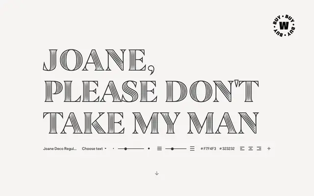
A French didone-inspired serif by Ale Navarro that blends calligraphic endings and glyphic serifs, with engraved and deco variants extending its range.
About
Joane takes cues from French didone traditions, combining high-contrast strokes with calligraphic terminals and glyphic serifs for a style that sits between classical warmth and typographic rigour. The family spans eight weights with matching italics, plus two specialist sub-families: Joane Deco and Joane Engraved, which broaden its application across decorative and print contexts. Suited to magazines, packaging, branding and editorial work where a refined serif with some personality is wanted.
Classification
Joane draws explicitly from French didone traditions with high contrast strokes, calligraphic endings and glyphic serifs, placing it squarely in the didone category.