Joane PRO
W Type Foundry · Ale Navarro · 2018
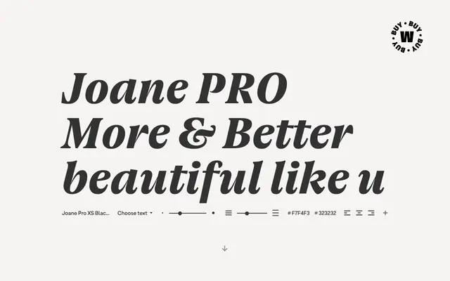
A high-contrast serif by Ale Navarro drawing on three centuries of European typographic tradition, offered across five optical sizes and nine weights.
About
Built on the original Joane (2018), this expanded Pro version spans 79 styles across five optical sizes from XS to XL, each tuned for its intended setting from small text to large display work. Nine weights from Thin to Black, each with an italic, give considerable range within each optical subfamily. The sharp features and organic texture reflect sources in French, Dutch and English punchcutting traditions across the 16th to 18th centuries.
Classification
Joane Pro is a high-contrast serif with sharp features drawing on French 16th-century, Dutch 17th-century and English 18th-century typographic models, placing it in the tradition of classical transitional and Didone serifs.