Moncler
W Type Foundry · David Súid
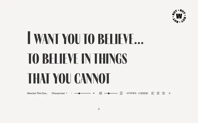
A high-contrast variable serif inspired by Dracula and renaissance art, built for dramatic titling across 21 styles and three width variants.
About
Designed by David Súid, Moncler draws from Bram Stoker's Dracula and the visual language of the renaissance to produce a typeface with pronounced stroke contrast and a theatrical character. The family spans seven weights from Thin to Black across Condensed, standard and Expanded subfamilies, totalling 21 styles, and is packaged as a variable font covering more than 220 weight and width combinations. Alternative symbols, a distinctive punctuation set and small-caps used as lowercase give it particular suitability for poster and graphic design work.
Classification
Moncler is a high-contrast serif with dramatic stroke variation and renaissance-influenced forms, designed explicitly for titles and graphic display work rather than text setting.