Munchies
W Type Foundry · Gaspar Muñoz
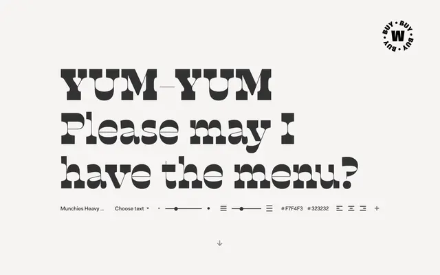
A reverse-contrast slab-serif in two subfamilies, Normal and Display, drawing on 19th-century wood letterpress and Italian Caslon traditions across six weights.
About
Designed by Gaspar Muñoz, Munchies inverts the conventional stress axis of a slab-serif, producing a striking optical effect suited to headlines and bold branding. The family splits into Normal, which carries a measured contrast reminiscent of Western poster lettering, and Display, which pushes that contrast to an extreme. Both subfamilies are available as variable fonts, and the character set includes small caps, ligatures and alternates for A, M, N, V, W, ampersand and arrows.
Classification
Munchies employs reverse contrast stroke construction across a slab-serif structure, drawing on 19th-century wood type and Italian Caslon traditions, which places it firmly in the display slab category with an inverted stress axis.