Saes Grotesk
W Type Foundry · Diego Aravena
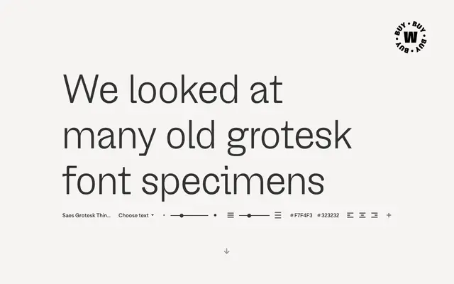
A grotesque sans by Diego Aravena that borrows the imperfections of nineteenth-century type specimens and folds them into a contemporary 18-style family with variable font support.
About
Drawing on Gothic, Grotesque and Grotesk traditions from the 1800s, Saes Grotesk uses historical ink trapping errors and slightly extended letter terminals on forms like 'a', 'c' and 'e' to give the design an organic, handmade quality. A squared double-storey 'g' activates an alternate ligature texture in running text, adding a distinctly odd rhythm. The family spans nine weights from Thin to Heavy, each with a matching italic, and is also available as variable roman and italic fonts.
Classification
Directly inspired by nineteenth-century grotesque sans serifs, the design draws on historical Gothic and Grotesk specimens while incorporating contemporary letterform details, placing it firmly within the grotesque subcategory.