Supera Gothic
W Type Foundry · Diego Aravena Salvador Rodriguez · 2020
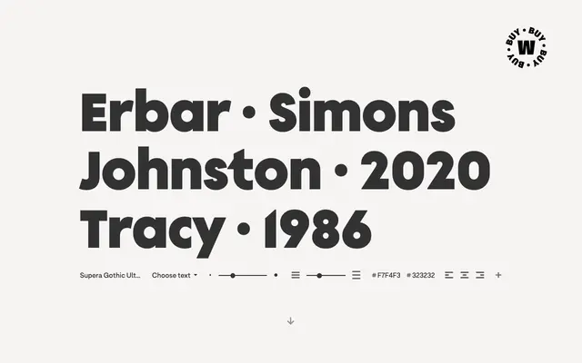
A sans-serif family blending Erbar Grotesk's geometric precision with Johnston's humanist proportions across nine weights with matching italics and variable font support.
About
Drawing directly from Jakob Erbar and Edward Johnston, this family carries pointed crossbars on the 'f' and 't' in heavier weights as a nod to Erbar, while uppercase proportions and numerals echo Johnston's calligraphic sensibility. The 18-style family spans Thin to Ultrablack with matching italics, and is also available as roman and italic variable fonts. OpenType features are included, making it practical across editorial, branding and screen-based work.
Classification
Supera Gothic draws from both geometric (Erbar Grotesk) and humanist (Johnston) early 20th-century traditions, blending geometric structure with humanist proportions, placing it at the intersection of geometric and humanist sans-serif.