Wordmark
W Type Foundry · Gaspar Muñoz
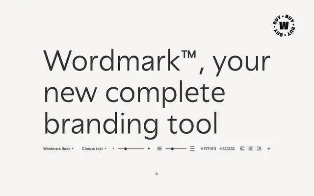
A 48-style humanist sans by Gaspar Muñoz built for branding, split into Normal and Display subfamilies each with condensed and italic cuts.
About
Designed by Gaspar Muñoz, this family draws on a humanist sans tradition suited to brand identities and signage. It splits into two complementary systems: Wordmark Normal, tuned for text readability across sizes, and Wordmark Display, drawn with a taller x-height for headlines and large-format applications. Six weights from Light to Heavy run across both subfamilies in full, regular and condensed widths, all with matching italics.
Classification
The foundry describes a refreshed humanist style with attention to readability across text and display uses, consistent with the humanist sans tradition favoured in branding and signage.