Kormelink
WiseType · Jacob Wise · 2019
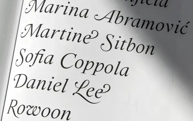
A high-contrast titling Roman by Jacob Wise, drawing on Times New Roman's architecture and the ornamental traditions of Renaissance and Baroque letterforms.
About
Designed in 2019 by Jacob Wise and named in tribute to his grandfather, a Dutch clockmaker and jeweller, Kormelink is a titling serif with sharp, ornate serifs, droplet terminals, a humanist axis and heavily modulated stroke. The family consists of a Roman and an italic set at 15°, the latter featuring flamboyant swash capitals and an extended range of OpenType ligatures. Both styles include text and titling figures, discretionary ligatures and a broad pan-European Latin character set.
Classification
A high-contrast Roman serif drawing from Times New Roman's architecture, Renaissance and Baroque opulence, and Neoclassical sharp serifs, placing it firmly in the transitional tradition with humanist influences.