Skrappa
WiseType · Jacob Wise · 2019
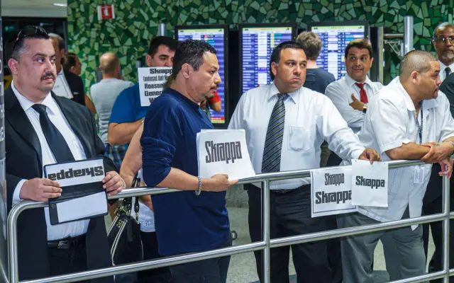
A bulky geometric display typeface by Jacob Wise, reworked in 2023 into a five-width variable family with roots in Ken Garland's 1964 First Things First lettering.
About
Originally sketched in 2018 as t-shirt lettering and inspired by Ken Garland's First Things First manifesto, the typeface was substantially redrawn and expanded in 2024 to version 2.0. Five widths run from Condensed to Wide, each with a matching italic, and a variable font covers width, slant and tracking axes. As the width increases so does the weight, keeping the silhouette compact across the range, and each style includes an alternate 'Tight' spacing set for close-tracked headlines.
Classification
A bulky, condensed geometric sans built explicitly for headlines and bold messages, with methodical construction rooted in modernist abstraction. Its rectangular, high-contrast structure and display-only intent place it firmly in the display category.