Workhorse Geo Dot
Workhorse Type Foundry · Adrian Kimball · 2021
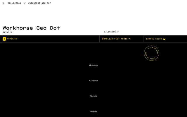
A dot-constructed geometric display face by Adrian Kimball, spanning five weights from wispy Thin to dense Semibold, with an optical size axis and multiple stylistic alternates.
About
Built entirely from a single tool — a set of dots — the family moves from open, airy strokes in the lighter weights to tightly packed, interpretation-dependent forms at Semibold. Its inspiration splits between large-scale showbiz signage and the rhythm of typewriters, yet it sits comfortably alongside the rest of the Workhorse Geometric collection. Stylistic sets offer alternates for G, J, M, Q, the ampersand and arrows, giving designers control over the face's personality.
Classification
A geometric sans constructed entirely from dots, drawing on showbiz signage and typewriter aesthetics. Its dot-matrix construction and optical-size axis place it firmly in display territory despite lighter weights being legible at smaller sizes.