Workhorse Gothic No.2
Workhorse Type Foundry · Adrian Kimball · 2024
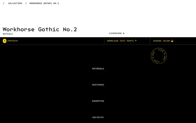
A variable grotesque in 54 styles drawn from the wonky proportions and oddities of nineteenth-century wood type.
About
Inspired by the idiosyncratic weight placement, contrast and strange proportions that characterised competing wood type foundries, this family stretches across nine weights from Hairline to Ultra in both regular and condensed widths. Each weight comes in upright, oblique and reverse-oblique cuts, and the whole family ships as a variable font with weight, width and italic axes. Three stylistic sets offer alternate characters including a modernist ampersand, a classic G and horizontally emphasised R, T and Y.
Classification
A wood-type-inspired grotesque sans with deliberately quirky proportions, contrast and weight placement drawn from the idiosyncrasies of nineteenth-century wood type foundries.