Gaya
Writtenshape · Raphaël de La Morinerie · 2020
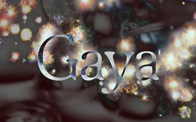
A humanist sans with soft, rounded forms derived from studying the blurring of type, designed for cultural institutions and editorial work.
About
Designed by Raphaël de La Morinerie and available since 2020, Gaya draws its character from the organic effects of blur on letterforms, producing curved shapes that harmonise across weights from Thin to Black. The italic cuts amplify the fluid quality, reinforced by an extensive ligature set. The family has found use in concert hall communications, festivals, book layouts and magazine design.
Classification
Gaya follows text character structure with organic, rounded forms derived from the study of blur effects on typography, placing it firmly in the humanist sans tradition with an expressive, fluid character.