Kateka
Writtenshape · Raphaël de La Morinerie
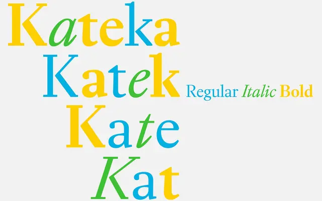
A text serif rooted in the baroque letterforms of Joan Michaël Fleischmann, rationalised through a straight-line digital drawing method for screen legibility.
About
Drawn by Raphaël de La Morinerie, Kateka takes cues from 18th-century Dutch punch-cutter Joan Michaël Fleischmann and rebuilds those baroque proportions using straight lines wherever possible, reducing curve complexity to sharpen rendering on screen. The result is a high-contrast text face with a pronounced slant in the italic, lending it enough presence for headings while keeping body text comfortable. Three styles are available: Regular, Bold and Italic.
Classification
Kateka draws on baroque details from 18th-century Dutch typographer Joan Michaël Fleischmann, placing it firmly in the transitional serif tradition, with a rationalist digital approach that modernises the historical forms.