Bronzo
XO Type Co · Rick Valicenti & Mouli Marur · 1989
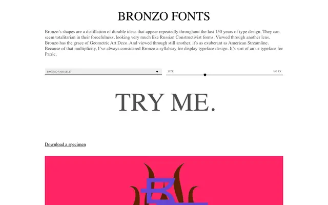
A revival of Rick Valicenti and Mouli Marur's 1989 geometric display typeface, expanded from three weights to nine with new language support and redesigned accents.
About
Originally drawn by hand at Thirst in Chicago to accompany Gilbert paper's Esse line, Bronzo became iconic enough to launch the Thirstype foundry in 1990 before disappearing when that studio closed. This XO Type Co redesign reconstructs its core tension: asymmetric centre strokes, incomplete curves that always break right, and proportions that sit uneasily between square and rectangle. The result evokes Russian Constructivism, Geometric Art Deco and American Streamline simultaneously, and is explicitly designed to be stretched, warped and slanted.
Classification
Bronzo is a display typeface with strong geometric construction rooted in Modernist ideals, drawing on Russian Constructivist forms, Geometric Art Deco and American Streamline styling. Its distinctive asymmetric stroke logic and uncomfortably wide proportions place it firmly in the display category.