Citrine
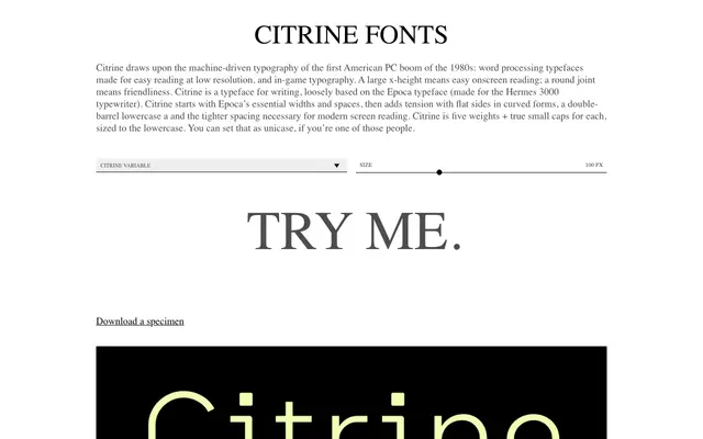
A screen-optimised humanist sans loosely derived from the Epoca typewriter typeface, built for writing and document work across five weights with true small caps.
About
Rooted in the Epoca typeface designed for the Hermes 3000 typewriter, Citrine takes that model's essential widths and spacing and reworks them for modern screen reading with flat-sided curves, a double-barrel lowercase a and tighter tracking. A large x-height and round joints keep it approachable at small sizes, while true small caps sized to the lowercase add typographic range. Available as a variable font spanning five named weights from Light to Bold.
Classification
Citrine draws from typewriter and early PC screen typography traditions, with a large x-height, round joints and flat-sided curved forms typical of humanist sans-serif design optimised for readability.