Havelock Titling
XO Type Co · Patric King
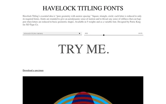
A titling-weight geometric sans by Patric King that reduces each letterform to its most elemental shapes, with rounded joints to counter any rigidity.
About
Built on the same underlying geometry as the layerable Havelock family, Havelock Titling strips away the inline, stencil and multiline variants to deliver a standalone typeface across five weights from Light to Black, also available as a variable font. Letterforms are reduced to square, triangle and circle with rounded joints that give each weight an aerodynamic quality while avoiding the stiffness that pure geometry can produce. Suited to headlines and identities where clean, highly constructed forms are wanted without the layering apparatus of the parent family.
Classification
A geometric display sans built around the reduction of letterforms to square, triangle and circle, with rounded joints for aerodynamic fluidity. Classified as display due to its titling-specific application and highly constructed geometric character.