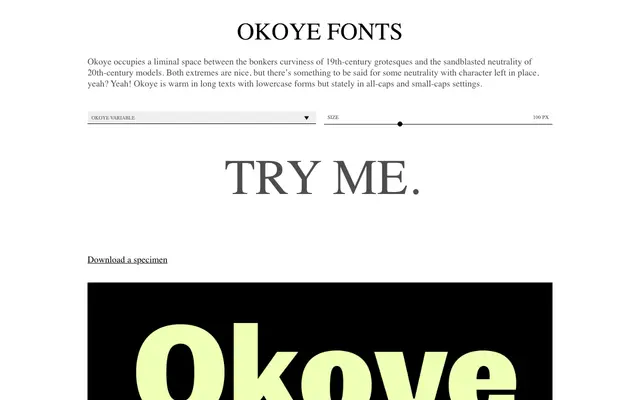
A nine-weight grotesque that transitions from near-monolinear in its light cuts to high-contrast in its heaviest, with handwritten traces in bowl construction and angular stylistic alternates.
About
Bowls sweep into stems on b, d, p and q in a manner that recalls handwriting, while small jutting details on the g and Q introduce angular counterpoints. Stylistic alternates (SS01) extend that energy to K, R, g and k, and spacing tightens progressively from open and airy in the lightest weights to close and imposing at Black. Small caps mirror full-size caps exactly, and the family ships with arrows and extensive Latin language coverage, making it usable across long-form text, labels and interface work.
Classification
Okoye sits between 19th-century grotesque curviness and 20th-century neutral sans, with monolinear light weights and high contrast in heavy weights — a contemporary grotesque with deliberate quirks.