Rocinante Titling
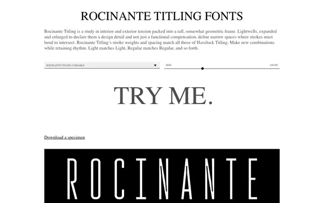
A tall, narrow display typeface built around deliberately oversized lightwells that turn a structural necessity into a defining visual detail.
About
The family is organised around the tension between interior and exterior space: lightwells are enlarged until they read as a deliberate design choice rather than a technical workaround, creating a distinctive squareness at joints and intersections. Five weights from Light to Black each carry an oblique companion, and the family ships as a variable font for continuous weight interpolation. Stroke weights and spacing are matched precisely to those of Havelock Titling, allowing the two families to be set together while preserving rhythmic consistency.
Classification
A tall, narrow titling face with geometric influences and deliberately enlarged lightwells; the condensed proportions and high stroke contrast place it firmly in the display category rather than text use.