displayhigh-contrast display
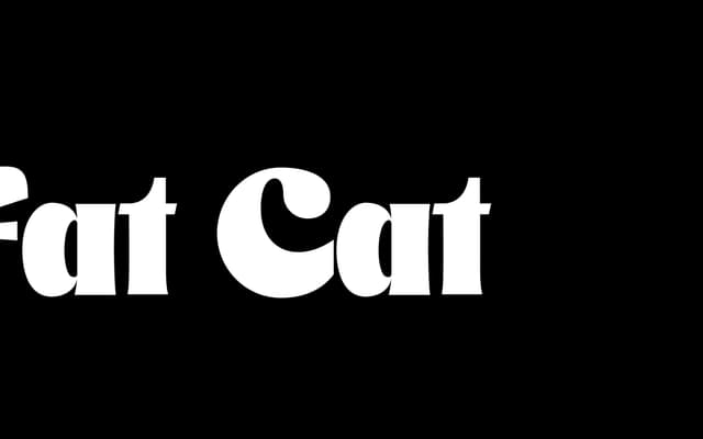
A high-contrast display serif with exaggerated thicks and thins, designed for large-scale setting with an air of old-money elegance.
About
Fat Cat works at headline and poster sizes where its dramatic thick-thin contrast can register properly. The foundry points to the numerals as a particular strength, suggesting a character suited to editorial and luxury contexts. Best used in mixed case or all lowercase at generous sizes.
Classification
Extreme thick-thin contrast and display-only sizing place this firmly in the high-contrast display category, with a decorative serif character suited to headlines and large-scale setting.
Weights
Regular
Languages
Latin
Tags
displayhigh-contrastserifheadlinedecorativeold-moneyeditorial