Altro
Zetafonts · Francesco Canovaro, Andrea Tartarelli, Mario De Libero · 2024
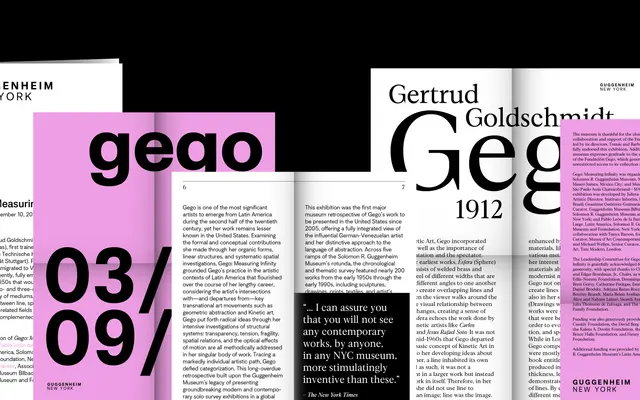
A three-subfamily type system pairing a Swiss-inspired grotesque, a flared variant and an old-style transitional serif across a shared set of eight weights and proportions.
About
Designed by Francesco Canovaro with Andrea Tartarelli and Mario De Libero, Altro builds a coherent system from three distinct voices: a low-contrast humanist grotesque with a slightly low x-height, a flare serif bridge, and an old-style serif with square dots and restrained ball terminals. All three subfamilies share the same proportions and weight range from Extralight to Fat, allowing switches between styles without disrupting typographic rhythm. The full family runs to 48 styles plus two variable fonts covering weight and serif axes.
Classification
The primary subfamily is a Swiss-inspired, low-contrast humanist grotesque; the family also includes a flare serif variant and an old-style transitional serif, making the grotesque the anchoring category.