Ambra Sans
Zetafonts · Francesco Canovaro, Cosimo Lorenzo Pancini, Andrea Tartarelli · 2022
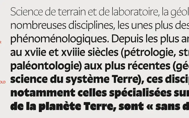
A humanist sans by Canovaro and Pancini that reinterprets Tartarelli's Tarif, balancing a calligraphic skeleton against a post-digital low-contrast execution across 30 styles.
About
Built from a development of Andrea Tartarelli's Tarif, Ambra splits into two subfamilies: a display cut with a taller x-height and single-storey g, and a text cut with slightly reduced proportions and untapered stems for better small-size screen rendering. Eight weights run from Light to Heavy in the display subfamily, with seven in the text subfamily, each accompanied by true italics and a variable font covering weight, optical size and italic axes. Coverage extends to 205 languages across Latin and Greek scripts.
Classification
Zetafonts classify Ambra as a humanist sans, drawn from a calligraphic skeleton with low contrast and a tall x-height. Its origins in the handmade letterform tradition place it firmly in the humanist sans subcategory.