Anaphora
Zetafonts · Francesco Canovaro, Andrea Tartarelli, Cosimo Lorenzo Pancini · 2017
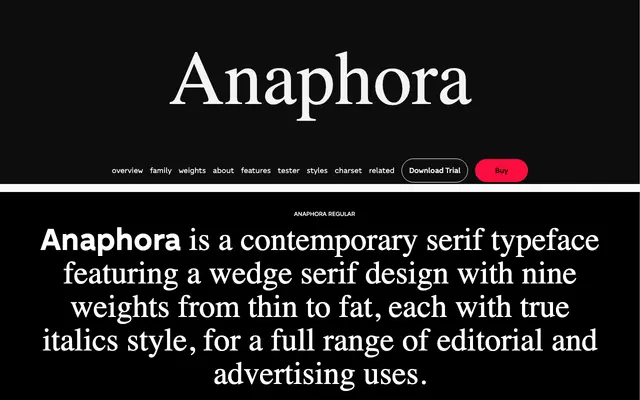
A wedge serif with nine weights, true italics and a stencil sub-family, covering Latin, Greek and Cyrillic across 200 languages.
About
Designed by Francesco Canovaro with Cosimo Lorenzo Pancini and Andrea Tartarelli, Anaphora pairs wide counters and a low x-height for comfortable reading at text sizes with distinctive letterforms that hold presence at display sizes. The 18-style serif set spans Thin to Fat with matching true italics, while four stencil cuts in Thin, Book, ExtraBold and Fat extend its use into titling and logo work. OpenType features include small caps, four figure sets, fractions, stylistic alternates and discretionary ligatures.
Classification
Anaphora uses triangular wedge serifs rather than bracketed or hairline forms, placing it in the Latin wedge or lapidary serif tradition. Its wide counters and low x-height give it a contemporary editorial character distinct from classical old-style or transitional models.