Anterior
Zetafonts · Francesco Canovaro · 2025
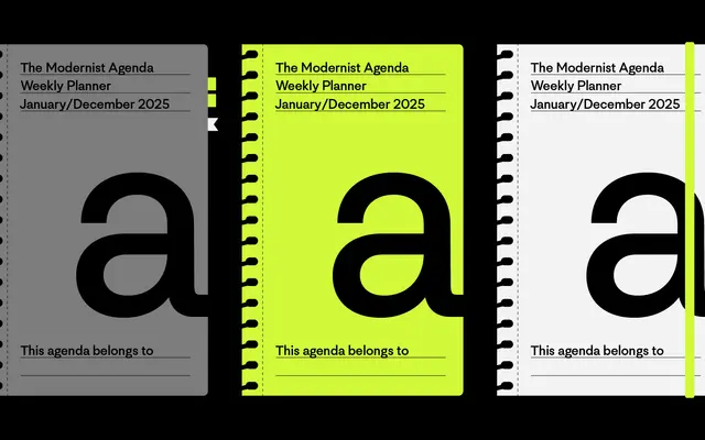
A 16-style sans-serif by Francesco Canovaro that crosses neo-grotesque rationality with the circular geometry of early Futura, including a stylistic set based on Paul Renner's original geometric drafts.
About
Designed by Francesco Canovaro with contributions from Filippo Sgarlata, Anterior runs from Thin to Extrablack across eight weights with matching italics and a variable font. The family draws structurally on Helvetica's optical discipline and Futura's modular geometry, and a dedicated OpenType stylistic set reproduces Paul Renner's strictest early forms, using circles and rectangles with orthogonal junctions. Coverage extends to 211 languages across Latin script, with small capitals, oldstyle figures, fractions and a broad set of alternates.
Classification
Anterior explicitly synthesises neo-grotesque structure (Helvetica lineage) with geometric modernist construction (Futura lineage), placing it at the intersection of grotesque and geometric sans-serif traditions.