Antipasto Pro
Zetafonts · Cosimo Lorenzo Pancini, Francesco Canovaro · 2017
A nine-weight geometric sans with Latin, Greek and Cyrillic coverage, expanded and refined in 2017 from an original three-weight release.
About
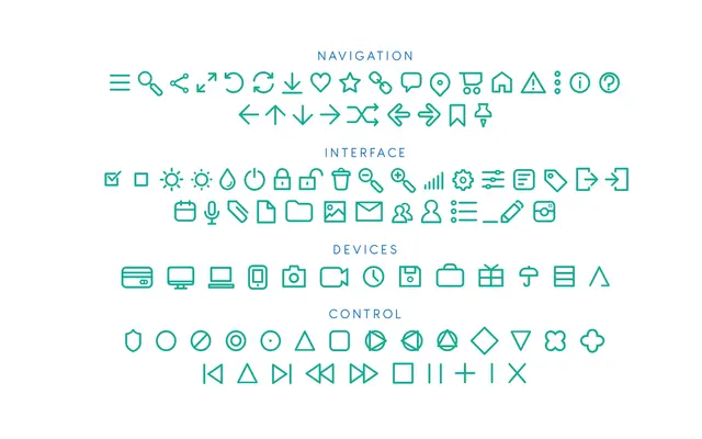
Originally a three-weight geometric sans by Cosimo Lorenzo Pancini, the family was revised and extended in 2017 as Antipasto Pro, adding six weights from Hairline to Extrabold and broadening script coverage to Latin, Greek and Cyrillic across 205 languages. OpenType features include small caps, old-style numerals, ordinals and discretionary ligatures, giving the family genuine typographic depth for editorial and branding use. A companion Icons subfamily mirrors each of the nine weights with a matching symbol set.
Classification
Zetafonts explicitly describes Antipasto as a geometric sans serif; the circular, constructed letterforms and uniform stroke weight confirm this classification.