Arista Pro
Zetafonts · Francesco Canovaro, Cosimo Lorenzo Pancini, Andrea Tartarelli · 2017
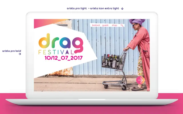
A rounded geometric sans with eight weights, alternate character sets and a companion icon subfamily, covering Latin, Greek and Cyrillic across 205 languages.
About
Originally released as Arista Z in 2007 and reworked into this pro edition in 2017, the family carries a soft geometric construction across eight weights from Hairline to Fat. Two stylistic versions offer design flexibility, and the companion Icons subfamily uses variable-width monoline glyphs calibrated to match text weight up to SemiBold. Small capitals and oldstyle figures are included as OpenType features.
Classification
Arista Pro is described as geometric and soft in approach, with rounded terminals and a clean monoline construction characteristic of geometric sans-serif design. The rounded quality distinguishes it from strict geometric or humanist models.