Arsenica
Zetafonts · Francesco Canovaro, Debora Manetti, Mario De Libero, Andrea Tartarelli, Cosimo Lorenzo Pancini · 2024
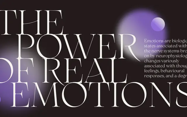
A superfamily of 41 styles drawing on early twentieth-century Italian poster lettering, built across four subfamilies from low-contrast antiqua to high-contrast display and body text cuts.
About
Designed by Francesco Canovaro and a team at Zetafonts, Arsenica traces its lineage to the eclectic lettering of artists like Giorgio Muggiani, whose work for Cinzano and Pirelli blended Old Style structure with Art Nouveau ornament. The family spans four distinct subfamilies: Antiqua preserves wide proportions and quirky period details, the core Display branch pushes contrast and calligraphic weight range, Alt strips away the decorative flourishes for a more restrained modern serif, and Text recalibrates contrast and spacing for sustained body copy. Two variable fonts covering weight and optical size axes, over 900 glyphs per style, and support for more than 200 languages across Latin, Greek, Cyrillic and Arabic make it a genuinely broad design system.
Classification
Rooted in Italian poster lettering of the early twentieth century, Arsenica draws on Old Style proportions with Art Nouveau and Deco inflections, ranging from low-contrast antiqua cuts to high-contrast display weights across four distinct subfamilies.